in the placement of the two unequal objects in the frame, with the greater mass, the larger building being closer to the centre than the smaller mass, the smaller building.
The second photo, taken at Derwent Water has balance in two places; firstly the horizon is near the top of the frame, giving a more dynamic emphasis to the lake in the foreground and secondly in the placement of the stones in the bottom left-hand corner which adds more detail to the lake counterbalancing the mountains on the horizon.

The third image, taken at Hampton Court palace is balanced by the placement of the statue in the left-hand corner against the bulk of the building in the right-hand corner - this larger mass overlaps the centre of the image.
As above this image, also taken at Hampton Court has the balance in the same place, with greater weight being given to the larger mass of the darker part of the brick wall and less weight to the flowers in the bottom right-hand corner.
The fourth image, again from Hampton Court Palace, has balance in a different way than the images above. In this case, the image is symetrical from the radiating lines around the frame's centre.
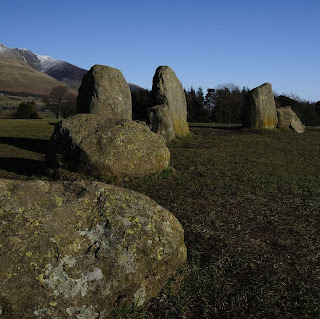
Finally, this image taken at the Castlerigg Stone Circle in Keswick, follows the principal of unequal objects being placed so that the larger object (the stone circle) is nearer the centre than the small object (the mountain). This image is further balanced by the position of the horizon in the top third of the frame creating a more dynamic composition.
The weighing scale diagrams are set out below:


No comments:
Post a Comment