Similar Colours:
The purple and green image that I used did not really fulfill the "similar" criteria, so this will be substituted for blue and grey:

The shot of the moth also didn't work very well; this was a subjective decision to include this one. It will be replaced instead by this picture of yellow and shades of brown in an owl butterfly; the picture would have been better if I hadn't clipped the top of one of the antennae, but it illustrates the colour point:

Green and Blue - my original was a wide shot of the lake, in which it was recommended that I reduce the brightness of the boat, however, I have since captured a much better image of green and blue, so I will use this one instead:

Contrasting Colours:
Orange, Purple and Green - reduce the red to see if it brings more attention to the blue (which worked nicely!):

Red and Blue: the image of the power station wasn't helped by the gas tank placed behind it. This picture might be representation of contrasting blue and red:

Orange and Green - my tutor commented that the colours are fairly similar because they melt in to each other so smoothly but there is some contrast with the darker green background. I have chosen not to make any corrections here.
Colour Accent:
Red danger sign accent - desaturate the other red shape a bit so that it doesn't compete with the sign:

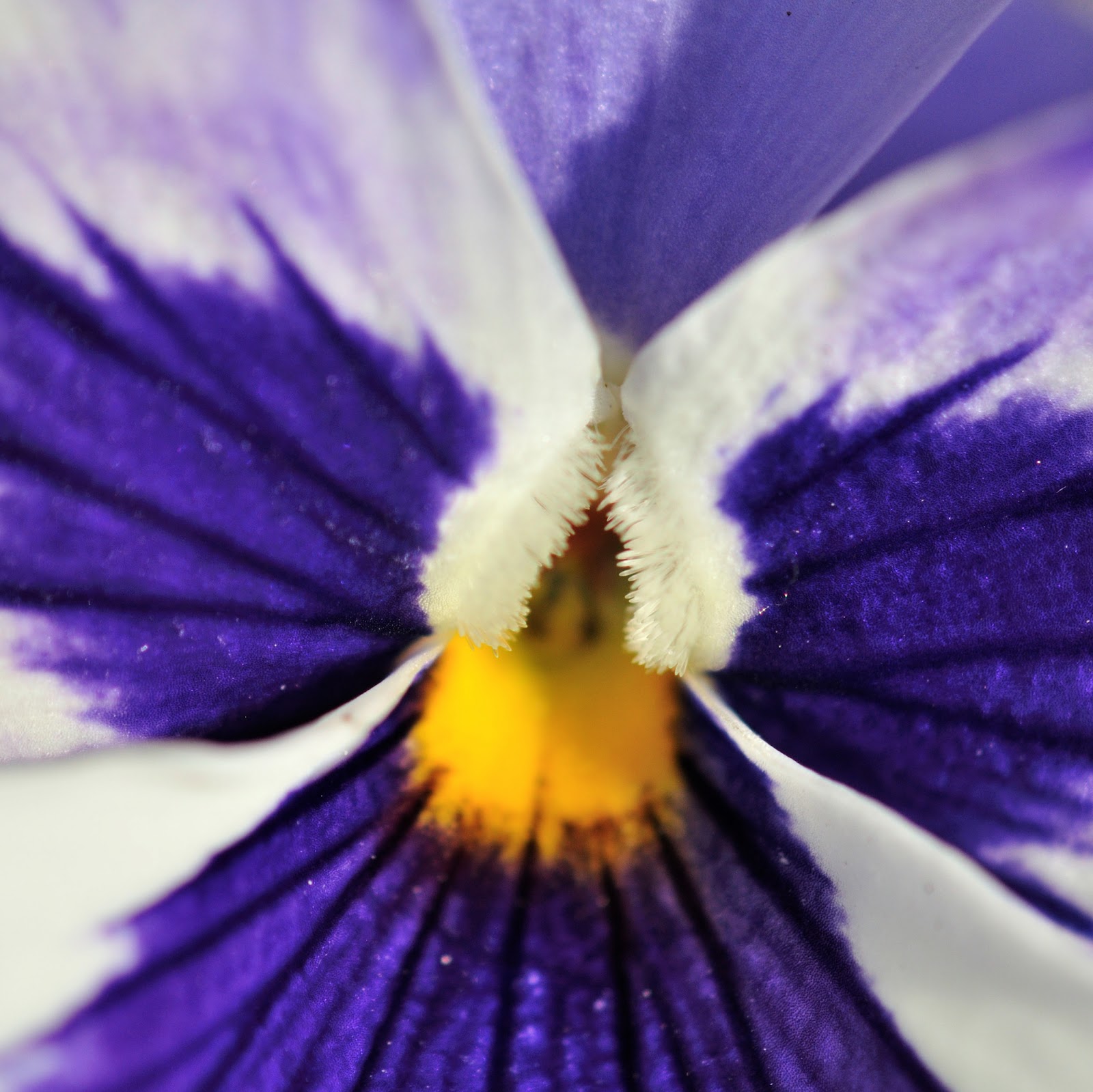
Purple accent - this shot didn't work - the accent wasn't strong enough. I have reshot using a yellow accent against purple:
Yellow accent - O2 - Snip a bit off the lower edge of the frame to make the speed boat more noticeable and balance the composition a bit better:

K.
No comments:
Post a Comment