The exercise required the shooting of three photographs for each of the six colours of the standard colour wheel: green, yellow, orange, red, violet and blue. One exposure was as the meter reading indicated (the higher middle image), and then one half a stop brigher (to the left) and the other half a stop darker (to the right). I have then marked which image most closely matches the colour in the wheel.
The instructions recommended shooting natural colours, so my first attempts were shot in a garden centre in an attempt to capture nature's colours:
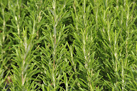
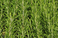
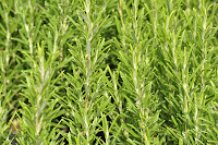
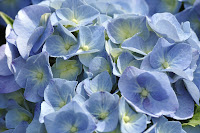
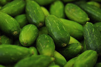
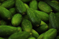
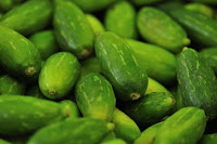
Green
 |
| 1/180s - f/9.5 |
 |
| 1/250s - f/9.5 |
 |
| 1/125s - f/9.5 |
For these greens, taken of rosemary plants, it is hard to say. The sun was quite bright, but I think that the darker image (1/250s) is the closest match.
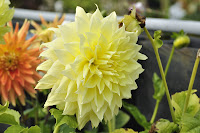
Yellow
 |
| 1/350s - f/9.5 |
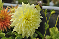 |
| 1/500s - f/9.5 |
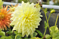 |
| 1/250s - f/9.5 |
None of these yellow flowers match the yellow of the colour wheel - they are too light. The colour wheel yellow is darker - more of an egg yolk colour.
Orange
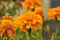 |
| 1/180s - f/9.5 |
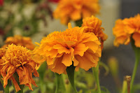 |
| 1/250s - f/9.5 |
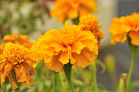 |
| 1/125s - f/9.5 |
The image that most closely matches the colour wheel is the darkest image the 1/250s; but this is significantly darker than the one used in the course materials, so a truer match would be the correctly exposed image at 1/180s.
Red
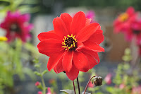 |
| 1/90s - f/9.5 |
|
| 1/60s - f/9.5 |
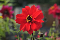 |
| 1/125s - f/9.5 |
The brightest image, 1/60s, most closely matches the colour wheel; the others are too dark.
Violet
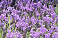 |
| 1/90s - f/9/5 |
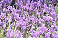 |
| 1/60s - f/9.5 |
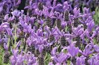 |
| 1/125s - f/9.5 |
None of these violets are close to the colour wheel; the colour wheel violet is a much darker colour.
Blue
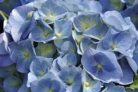 |
| 1/350s - f/9.5 |
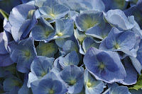 |
| 1/500s - f/9.5 |
 |
| 1/250s - f/9.5 |
None of these blues are close to the colour wheel; the colour wheel blue is a much darker colour- more of a royal blue - these are more cerulean in colour. But there are patches on the flowers that are close to a darker blue - these are more prominent in the underexposed shot at 1/500s.
After flowers, I then tried my hand at fruit and veg:
Green
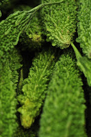 |
| 1/125s - f/4.8 |
 |
| 1/90s - f/4.8 |
 |
| 1/180s - f/4.8 |
Macro shot of some Asian vegetables, the metered reading of 1/25s is the closest to the green of the colour wheel.
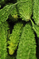
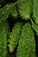
 |
| 1/250s - f/4.8 |
 |
| 1/350s - f/4.8 |
 |
| 1/180s - f/4.8 |
In this case, a macro shot of a different kind of Asian vegetable, the 1/180s is the closest to the green of the colour wheel.
Yellow
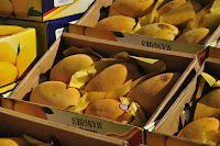 |
| 1/125s - f/9.5 |
 |
| 1/90s - f/9.5 |
|
|
|
|
|
|
|
|
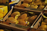 |
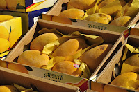
| 1/180s - f/9.5 |
Boxes of mangoes, also shot with a macro lens. In this collection, the shot that is half a stop underexposed is the closest to the yellow on the colour wheel, although still a little darker. In reality mangoes are more orange than this, they are reflecting bright sunlight.
 |
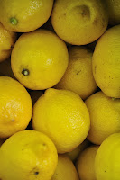
| 1/90s - f/4.8 |
 |
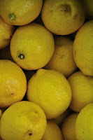
| 1/60s - f/4.8 |
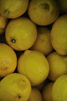 |
| 1/125s - f/4.8 |
Lemons, a more acidic yellow than mangoes. The underexposed shot at 1/60s is the closest to the colour wheel yellow; the others are too dark, but this is because they were in the shade.
Orange
 |
| 1/60s - f/4.8 |
 |
| 1/90s - f/4.8 |
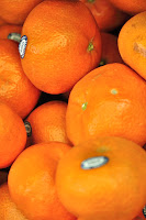 |
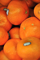
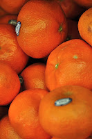
| 1/45s - f/4.8 |
Also shot in the shade, the underexposed shot at 1/45s is the closest match to the colour wheel.
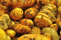 |
| 1/30s - f4.8 |
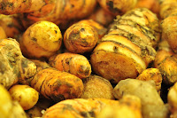 |
| 1/20s - f/4.8 |
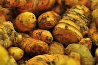 |
| 1/45s - f4.8 |
|
|
Tumeric roots shot in the shade; the metered exposure at 1/30s is the closest to the colour wheel.
Red
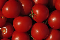 |
| 1/90s - f/9.5 |
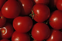 |
| 1/125s - f/9.5 |
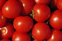 |
| 1/60s - f/9.5 |
Shiny tomatoes ripening in the sun; the metered exposure at 1/90s is the closest red to the colour wheel.
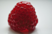 |
| 1/180s - f/4.2 |
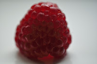 |
| 1/250s - f/4.2 |
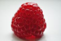 |
| 1/125s - f/4.2 |
A single raspberry placed on a window sill to ensure maximum light (on a dark day...) shot using a macro lens with the camera set to ISO 800 to ensure maximum colour. None of the images matches the colour wheel red really closely - these are all too pink. I think there are patches on the lighter two - the 1/180s and the underexposed 1/125s that qualify - but still too pink really. The overexposed shot has intensified the pinkness.
Violet
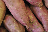 |
| 1/125s - f/4.8 |
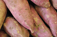 |
| 1/90s - f/4.8 |
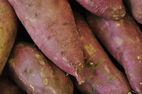 |
| 1/180s - f/4.8 |
|
|
|
|
|
These sweet potatoes were more of a pinkish colour in reality, but in the shade and with the darkest exposure, 1/180s, the colour is very close to the violet of the colour wheel - just a touch too red!
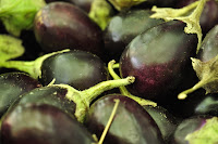 |
| 1/30s - f/4.8 |
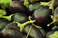 |
| 1/45s - f/4.8 |
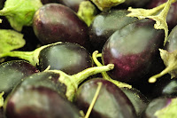 |
| 1/20s - f4/8 |
Shiney baby aubergines, a very dark shade of violet. The lighter patches on the lightest exposure of 1/20s are just about the violet of the colour wheel, but really the overall colour is too blue to be accurate.
Blue
The only blue fruit and veg I could think of was blueberries. I know you can get blue potatoes but not in Feltham...These blueberries were shot with a macro lens with the blueberries placed in a bowl on the window sill with the camera set to !SO 800 to try to get as much blueness as possible.
 |
| 1/90s - f4 |
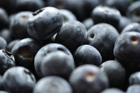 |
| 1/60s - f/4 |
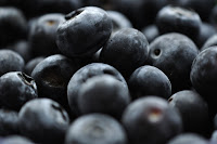 |
| 1/125s - f4 |
These results are quite interesting; for a start the blueberries aren't the same blue as the colour wheel - these are more of an indigo colour rather than a royal blue. What happens in the under exposed image is that the blue becomes blacker and in the underexposed image more washed out. But the shade of blue doesn't change.


