- Spend as much time and as much care as possible over a photograph. At the moment, I spend more time processing afterwards and less time composing beforehand, so this needs to change.
- Look for interesting shapes, colours and textures.
- Learn from professional work; keep a scrap book of interesting images.
- Use different lenses, lengths and angles to get the right shot.
- Use aperture settings to set points in focus and other points out of focus
- Use panning to express movement
- Consider the position of the subject in the frame
- Make a sequence
- Take the same image with different focal lengths and different viewpoints
- Aim for balance in the frame
- Think about where to position the horizon
- Think about frame shapes and sizes: horizontal, vertical, square
- Crop photos to find new pictures within the same image
- Look for contrasts.
Sunday, 29 April 2012
Learning points thus far
Having completed all the exercises leading into Assignment One, I thought it would be useful to summarise the learning points from the course thus far, both reminders and new focus points:
Cropping
I often think of cropping as a remedy for a badly constructed photograph; this exercise teaches that this is not a good strategy, and cropping should in fact be used to find different pictures within photographs already taken.
 The first image to be treated, a shot of a lion/gargoyle type statue shot at Hampton Court, was taken with an unusual perspective (Dutch tilt) in an attempt to make the picture more dynamic, but also because I looked the combination of bright cloud juxtaposed with menacing cloud. I also liked the inclusion of the flag adding a touch of movement and colour.
 I then selected an area for cropping reducing the amount of menacing cloud thus removing the attention from the cloud and restoring some balance in the composition.

The final result is a square image that is more dynamic than the original. The reduction of the cloud brings more attention to the statue, with enough cloud left to leave the impression of a storm closing in. In addition, the Dutch tilt works better in this case with the square format.
 This image was further improved by processing into black and white, reducing the brightness and adding more contrast and sharpness. Although the colour of the flag is lost, the overall result is pleasing and almost Gothic!
 The second image selected for treatment was shot in the Oxo Tower restaurant on the occasion of a friend's hen party. This image shows the hen holding up a heart-shaped gift. Intended as a snapshot, the image has a lot of background detail.
 The first crop was to exclude some of the background detail so that the focus was purely on the hen and her present. This brough the shape of the gift out more as it was not competing with other objects in the frame.
 The final result is a pleasing and happy picture with balance between small objects (gift and lower hand) against the larger object (face and body).
 I then saw the possibility for another picture within this image focussing purely on the heart and the lower hand.
 The resulting image is really pleasing as it makes the hen's engagement ring stand out and balances the image with some sparkle at the bottom against the mass of sparkles at the top.
 The image was then finally improved further with some processing to firstly turn the image into black and white and then invert colours; this makes the image look slightly abstract and could potentially be used for a greetings card!
 My third image for the cropping treatment was also shot at Hampton Court. A photo was taken of an archway with the interesting perspective of the walled path and centrally weighted composition.
 The possibility for a picture within this image naturally lies in the archway.
 I cropped the image tight excluding everything except the arch and what is within the arch. Without the distraction of the walled pathway and the rest of the main building, this brings out the features within the arch and also the moss on the top of the arch.
 I then processed the image further setting the sharpness to the maximum to enhance the brick features and make them look more textural, brought down the brightness slightly, enhanced the contrast to add greater depth behind the arch and set the image to sepia to make it look older.
This exercise has shown that although cropping can be a rescue strategy, it can also be used as a creative technique to find pictures that may not have been seen at the time of taking the photo.


The final result is a square image that is more dynamic than the original. The reduction of the cloud brings more attention to the statue, with enough cloud left to leave the impression of a storm closing in. In addition, the Dutch tilt works better in this case with the square format.


This exercise has shown that although cropping can be a rescue strategy, it can also be used as a creative technique to find pictures that may not have been seen at the time of taking the photo.
The Photographers Eye by Michael Freeman
Reading the Photographers Eye by Michael Freeman, which tackles the all the different aspects of compositon. Interesting, clearly written and very relevant to the point I'm at in the course. Of particular note is the section dealing with contrast, which has provided me with some preparation for Assignment One. Taught during the Basic Course at the Bauhaus, the concept of contrast between two oposing elements was the basis of composing an image (orignally for art but these translate well into photography). Contrast can be between shapes, tones, light, colours, sensations, concepts, quantities, sizes, proportions, emotions, and so on.
This book is of particular interest to me as it tackles many subjects that can be thought about at the time of taking the photo, which I don't do. I still rely on instinct and then I think about composition afterwards during processing. So a learning point for me is to take more time with composition at the time of shooting, rather than later when I'm downloading the photos from my camera.
So much to think about....!
Positioning the horizon
The objective of this exercise was to understand the impact of the horizon line on the composition of the photograph. A sequence of six photographs were taken (with an ipad through an office window so apologies for the window reflections in some of the images) to experiment with the position of the horizon line. The results are as follows:
 The first shot taken with the horizon close to the bottom of the frame works well because the sky was so amazing that day.
 The second shot, giving greater weight on the buildings below the horizon also works well but some of the drama of the huge clouds is already lost. This image is still however dynamic.
 In the third image, the horizon is closer still to the middle of the frame and some of the balance with the sky is lost and the image is even less dramatic. But the strong leading lines of the building in the bottom left-hand corner pointing towards Canary Wharf on the horizon add balance and focus back into the image. Although the horizon in this case is closer to the middle than the image above, this image works better because of the appearance of those lines.
 In the fourth image, the horizon is above the middle and the buildings in the foreground are more visible. In terms of composition, this works, if the interest is on the buildings. It's a great view looking east to Canary Wharf, but the bottom of the frame has captured a flat roof beneath my office, which although it gives some perspective on height, it's not an attractive feature to include in the image. If I was showing this image, I would crop that out. It's a pity though that at this point the dramatic sky is now lost.

Finally, even more so than the image above, this sixth photo is almost entirely buildings with virtually no sky and definately no interesting clouds. For me this shot does not work at all.
A few days prior to this, I was fortunate enough to see a rainbow on the horizon So (echoes of Blue Peter), here's one I made earlier! In this case, the image works well, because the drama of the sky is captured, the leading lines of the buildings pointing to Canary Wharf are there, plus the added bonus of the light over Canary Wharf making it look almost Biblical! The image is also dynamic as the horizon is not exactly in the middle (I did crop some grey sky out though).

Balance
Balance can relate to shapes, but it can also relate to tones. This exercise involved interpreting six previously taken photographs and interpreting the balance in each. I have loaded the six originals below, and then reloaded them with annotation in the image and some commentary to explain where the balance lies.


 In this picture taken at Avebury, the balance firstly lies in the placement of
the horizon and the roof top dividing the picture roughly into three
horizontal segments. There is also balance in another respect
In this picture taken at Avebury, the balance firstly lies in the placement of
the horizon and the roof top dividing the picture roughly into three
horizontal segments. There is also balance in another respect
in the placement of the two unequal objects in the frame, with the greater mass, the larger building being closer to the centre than the smaller mass, the smaller building.

 The second photo, taken at Derwent Water has balance in two places; firstly the horizon is near the top of the frame, giving a more dynamic emphasis to the lake in the foreground and secondly in the placement of the stones in the bottom left-hand corner which adds more detail to the lake counterbalancing the mountains on the horizon.

The third image, taken at Hampton Court palace is balanced by the placement of the statue in the left-hand corner against the bulk of the building in the right-hand corner - this larger mass overlaps the centre of the image.
 As above this image, also taken at Hampton Court has the balance in the same place, with greater weight being given to the larger mass of the darker part of the brick wall and less weight to the flowers in the bottom right-hand corner.
 The fourth image, again from Hampton Court Palace, has balance in a different way than the images above. In this case, the image is symetrical from the radiating lines around the frame's centre.
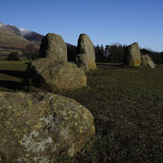
 Finally, this image taken at the Castlerigg Stone Circle in Keswick, follows the principal of unequal objects being placed so that the larger object (the stone circle) is nearer the centre than the small object (the mountain). This image is further balanced by the position of the horizon in the top third of the frame creating a more dynamic composition.

The weighing scale diagrams are set out below:
Identifying the balance in each image was fairly easy, although in at the time of taking, none of this was deliberate. The balance was decided by subjective judgement at the time, rather than actively thinking about the ratios.


in the placement of the two unequal objects in the frame, with the greater mass, the larger building being closer to the centre than the smaller mass, the smaller building.


The third image, taken at Hampton Court palace is balanced by the placement of the statue in the left-hand corner against the bulk of the building in the right-hand corner - this larger mass overlaps the centre of the image.


The weighing scale diagrams are set out below:

Sunday, 22 April 2012
Vertical and horizontal Frames
The purpose of this exercise was to show that most scenes work vertically. Most people habitually take photographs in a horizontal format, however, depending on the scene, vertical may be more appropriate. I shot 20 pairs of scenes at Hampton Court Palace (plenty of subjects to chose from). I tried as far as possible to take each pair without moving so that the focus point was the same in each case and from the same distance. This meant that getting the right composition in each shot was not always possible, but I wanted to demonstrate the importance of chosing the correct aspect between vertical and horizontal.
The shoot was further challenged by fast moving clouds, so constantly changing light conditions, and having broken my 18-55m lens, I was relying on a 55-200m lens. This is notwithstanding getting caught in hail shower and trying to get shots without people wandering in and out of view!
The results of the exercise are as follows; in my view, not all scenes work vertically, some work better horizontally - it really depends on the subject matter. For me, it is not about habit, as I already shoot vertical images. I often try something in both aspects to see which in practice works well (one of the advantages of digital photography!).


Naturally, the first images were shot at the entrance; in these I think the vertical format works better; the weight of the columns balances the statues. However, I like the clouds in the horizontal format, which are lost in the vertigal format. Perhaps a few seconds later, I may have got both!

The next pair were taken of the detail on the entrance gates using a wide aperture to gain clarity on one of the ornaments. With this pair, I think the horizontal format works better, as more detail of the gate is captured.

I then stumbled across an interesting doorway. Clearly in this sequence, the vertical format is better; not only because more of the gold leaf is captured, but also the format reflects the shape of the doorway. With the horizontal shot, I was also limited by the choice of lens and position. Had I stood further back, this aspect may have worked too.


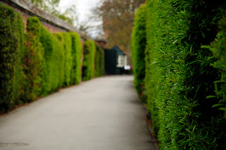

Next into a walled pathway lined with foliage; for these shots I used a wide aperture to blur the background and focus on the leaves to the right foreground. I think both shots work well here; the horizontal is interesting as you see the pathway with the kiosk at the end and the vertical is interesting as you are left wondering what is on the left-hand side.


The shoot was further challenged by fast moving clouds, so constantly changing light conditions, and having broken my 18-55m lens, I was relying on a 55-200m lens. This is notwithstanding getting caught in hail shower and trying to get shots without people wandering in and out of view!
The results of the exercise are as follows; in my view, not all scenes work vertically, some work better horizontally - it really depends on the subject matter. For me, it is not about habit, as I already shoot vertical images. I often try something in both aspects to see which in practice works well (one of the advantages of digital photography!).


Naturally, the first images were shot at the entrance; in these I think the vertical format works better; the weight of the columns balances the statues. However, I like the clouds in the horizontal format, which are lost in the vertigal format. Perhaps a few seconds later, I may have got both!

The next pair were taken of the detail on the entrance gates using a wide aperture to gain clarity on one of the ornaments. With this pair, I think the horizontal format works better, as more detail of the gate is captured.

I then stumbled across an interesting doorway. Clearly in this sequence, the vertical format is better; not only because more of the gold leaf is captured, but also the format reflects the shape of the doorway. With the horizontal shot, I was also limited by the choice of lens and position. Had I stood further back, this aspect may have worked too.


With this next pair of images, both aspects are balanced, but I prefer the horizontal layout: the composition is marginally better.


Next to the bridge; which aspect here is better depends on whether more sky or more bridge is preferred. The horizontal aspect, initially seems better composition, but with the sky being interesting on this day, the vertical shot also works.


Back to the palace; in this pair, the vertical scene works better. For a start the tree has not been accidentally cropped at the top (limitations of the lens), the festival sign is excluded, and the scene is more balanced by cropping the right of the building, which adds unnecessary detail. Had I shot more sky and less grass, the vertical image would have been even better.


Next to the palace entrance; the vertical image also works better in this pair, as it captures the interesting relief above the doorway and excludes the building aspect to the left. Although in the horizontal aspect, I like the continuation of the wall in the foreground towards the left. Had I been stood further back, the horizontal image may have worked better overall.


Then a lucky sighting; two palace members of staff in their uniforms. Here the vertical aspect is clearly the better shot: it includes the full archway of the bridge and provides height above their heads plus a full body shot.


To the left of the uniformed ladies, I noticed a little doorway with a balcony. In this shot, I prefer the vertical position; the doorway is better balanced among the five other windows making more of its corner position.


Moving onto gargoyl-like statues (gargoyls are a particular favourite of mine); with this pair, the vertical aspect also works better: it reinforces the column supporting the statue, and the adjacent lampost, whilst also capturing some cloud detail. The shot could have been improved by exluding the edge of the wall to the right of the picture (I would crop this if I were going to use the image). I also like the fact that the vertical image is able to capture the corner of the wall and exclude the extending structure to the left.


Looking around, I noticed the statues on the edge of the gable. This shot was unfortunately challenged by the light. I prefer the vertical position; it captures more of the detail on the chimney and the position of the window balances the shot. This image would have been improved though had I zoomed in further and just focused on the little statues.


Then I noticed a plaque on the wall of the Emporer Nero (why?). In this photo, although the subject matter and the angled wall lends itself to vertical composition, the horizontal frame works better as the image is balanced and made more interesting by the detail of the window on the right.


Then, a break in the clouds, meant that I could get a shot of the flag I had noticed flying above the ramparts. I think the vertical frame is more balanced; it emphasises the flag pole, gives greater height to the sky and greater depth to the building structure below the flag.


With some good light now, I returned to the gargolye-like statues; I think both these frames work equally well. The vertical frame emphasises the shape of the dragon's back and bolsters it, but the horizontal frame captures more sky and more of the doorway and flag behind. I used a wide aperture to blur the background here.


Now to the relief above the entrance to the main building; in this case I'm not sure either frame has worked. The horizontal position is not centred, so for reproduction that would have to be cropped; the vertical frame does not include enough of the surrounding to balance the image. The image is also split in two. This subject is better, either zoomed in to a section of the subject, or as part of a wider composition (as captured above).


After this I wandered round to the left. I noticed the continuation of windows on the long building on the left of the main entrance. I initially thought the horizontal aspect would work better as it would capture more windows, but in fact, by excluding the window to the right, the vertical aspect achieves the same effect, with the result that the vertical fame is more balanced. It includes foliage underneath the windows, so the horizontal and vertical planes are weighted. In addition, in the vertical frame the top of the all but one windows are included. This preference is marginal though; both images work and with a different lens, the horizontal frame would probably be the better option.


Then I noticed an interesting rounded cross shape on the wall; I don't have a preference for either frame here, I think they both work. The vertical frame emphasises the upright of the cross and the window, whereas the horizontal frame includes more detail of the window.
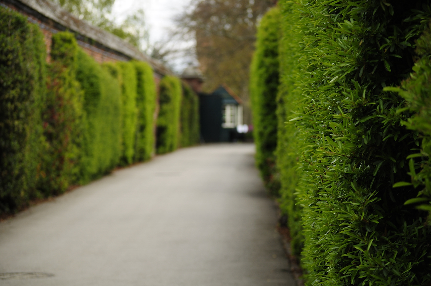

Next into a walled pathway lined with foliage; for these shots I used a wide aperture to blur the background and focus on the leaves to the right foreground. I think both shots work well here; the horizontal is interesting as you see the pathway with the kiosk at the end and the vertical is interesting as you are left wondering what is on the left-hand side.


Finally, at the end of the pathway, I saw a tree with huge roots surrounded by bluebells. In this shot, the vertical frame works better as it emphasises the tree and shows the depth of the bluebells in the background. If I were going to use this image, I would crop the top slightly to remove the edge of the bed.
Subscribe to:
Posts (Atom)