A fantastic and satisfying exercise; finding subject matter for this was not hard, but making the final selection was extremely difficult indeed (particularly when it came to choosing one photo demonstrating contrast within the image)! I had read ahead and so had sufficient time to prepare images that I might be able to use later, however, I found that in the end the majority of the images I chose came from one fruitful day spent wandering around London specifically looking for subjects that might be used to represent the values prescribed. The challenge I set myself was not only to capture the point in question, but also to try to incorporate what I had learnt on the course so far, including balance, position, shutter speeds, and whether to use vertical or horizontal frames.
Black and White
 |
| Black |
For my black photo, I stumbled across an ugly metal fish that formed the base of the lampposts along the south bank near the London Eye and London Aquarium. I wanted to take an image that had no boundaries so that there was no sense of proportion: the only thing that mattered was the blackness. The challenge lay therefore in where to proportion the facial features and how to reduce the reflection. Fortunately, the light was not too bright, so there was not much reflection (and I was able to reduce it further in processing) and I opted to balance the mouth against the eye. I didn't quite achieve a perfect "Golden Section", but I think it's close enough to convey some tension in the image.
 |
| White |
My white image was a lucky sighting: a vintage car with wedding ribbons. I like the subtle shade in this image. The whiteness is further emphasised by the chauffer's white hair, the white wheel, the white street name sign, and the white building behind the car. I shot the image with the edges of the car excluded so as to convey the impression of the white continuing beyond the frame of the photo.
Continuous and Intermittent
 |
| Continous |
An unusally empty escalator on the Tube provided the perfect opportunity to capture an image of something continuous. Although the image has frozen the action, the viewer will know that the escalator will continue to move continuously. I like the tones in this image with the hint of colour in the signs (which are also continuous!).
 |
| Intermittent |
I simply took this image because I liked the colour of the floats against the murkiness of the Thames with their very subtle reflections in the water. Once I had decided to use this image to represent "intermittent" I had to decided where to place the horizon (which included Tower Bridge). I decided in the end that the horzion interferred with the floats and so cropped it out. The boats in the top left-hand corner add some simple context to the image.
Diagonal and Rounded
 |
| Diagonal |
This is one of the few images taken in preparation, that made it through to the final cut. This was originally taken because I liked the pattern of the slate falling down the fell-side (along the Honister Pass in Cumbria), which I orignially shot with the intention of creating an abstract image. The diagonal stripes add a sense of drama to the image and give the slope a sense of perspective. This was shot on a cloudy day with little colour definition, so I altered the hue and saturation slightly to give the colours more depth.
 |
| Rounded |
An obvious choice here: a perfectly rounded metal sculpture, and the square format being the ideal frame to position it in and emphasise the roundness further. I converted this into black and white as I wanted the focus to be entirely on the shape of the sculpture and not to be distracted by the bright green foliage behind it. There is an additional round subject in this image: the sculpture reflects City Hall, which itself is also a round sculpture. Plus, the image is also anchored by its round shadow on the pavement.
Many and Few
 |
| Many |
I shot numerous photos of people in crowded places for my "many" concept, however in the end this image of an acer tree won because of its striking colour. Again I chose the square format because I wanted symmetry in the image and I also wanted a frameless shot to give the idea that the "many" had no boundaries. This image was shot in Cumbria and the red is a welcome change to the usual grey and green!
 |
| Few |
Another image from Cumbria, which is generally well populated with sheep, but there are only a few in this image (four in total). When I shot this image, I thought about the position of the lamb in the frame, remembering the exercise on the object in different places completed earlier. I also used a wide aperture to blur the background to make more of the lamb in the foreground. There is contrast within this photo between young and old animals.
Pointed and Blunt
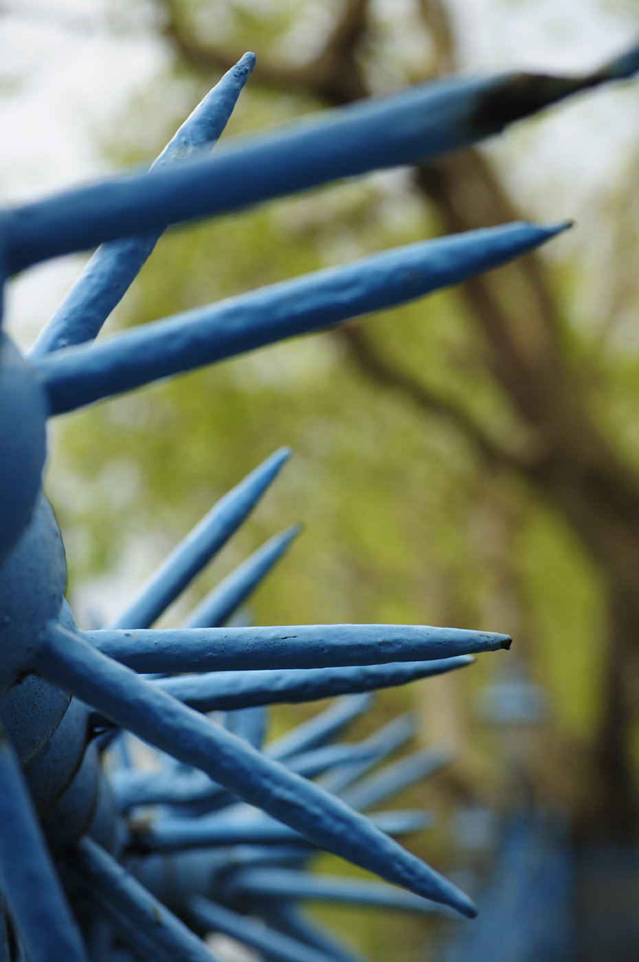 |
| Pointed |
In looking for pointed objects, I noticed that London certainly has its fair share of "torture instruments", particularly around historical buildings! Resisting the temptation to use an image of The Shard, which would have been too obvious, I liked these pale blue spikes located along the Thames. I shot these as I was looking for blue subjects for a Camera Club project, but they are so pointed that they make an ideal choice to use here. This also provided a great opportunity to use a wide aperture to focus on the foreground and blur the background. A horizontal frame might have been a more obvious choice for this subject, but by using a vertical frame, I was able to capture the higher spikes as well.
 |
| Blunt |
Had I used an image of the The Shard as my pointed choice, I would have used the Gherkin as my blunt choice; but instead I have shot a brightly painted post, one of many in the walk past Sugar Quay to the Tower of London. The vertical frame with central positioning was really the only option for this image, as the background was boring concrete and not worth including as part of the image. Unfortunately there was no shade at the time; a strong shadow would have made the image more vibrant and dynamic.
Smooth and Rough
 |
| Smooth |
I found these metal pillars round the back of Liverpool Street Station on my way to work one day; they are beautifully smooth and shiny. With even texture, tone, colour and shape throughout the image, I balanced it by using the rule of thirds to frame the pillars.
 |
| Rough |
In direct contrast to the smooth shiny metal, this image is a close-up of a boulder (granite?) stranded along the Honister Pass in Cumbria. In processing, I increased the contrast and also enhanced the colour intensity to make the image more striking. The end result clearly shows the roughness of the stone.
Still and Moving
 |
| Still |
There are several still features in this image shot at the Scott of Antarctica exhibition currently showing at the Natural History Museum. Firstly the lady is standing completely still while she studies the exhibition, secondly her bag is (obviously) also still, and thirdly the image she is looking at resembles an old black and white movie still. I like the composition in this image, with her standing to one side providing some space to also show the exhibit.
 |
| Moving |
I am surprised by this photo, having previously been unsuccessful with panning. Not only is the bike in focus, but amazingly the rider is looking at the camera. I like the position of the bike in the centre of the image, as it gives the impression of him travelling through it. I cropped some of the foreground out to add length to the overall horizontal effect.
Straight and Curved
 |
| Straight |
There are an infinite number of straight objects to photograph in London, but I liked the spokes of the London Eye as they are completely dead straight. From this view they seem unlikely to be able to support the weight of it the huge Eye!
 |
| Curved |
And in direct contrast to the straight spokes, are the curved capsules and the curved wheel itself. I converted both these images to black and white as I wanted to focus entirely on the shapes and exclude the distraction of colour. I also like the composition of both these images; the "straight" one is an obvious choice to represent the radial symmetry, and the "curved" image has tension in the use of the space within the frame.
Contrast in "one picture"
 |
| Straight and Curved |
Still on the theme of "straight and curved" I shot this image on the way to work one morning in the Broadgate development around the back of Liverpool Street Station. The main subject of the image is the fat lady statue, beautifully curved and shiny, juxtaposed against the straight, square, dull, uniform office buildings behind. Again I converted this image to black and white, in order to emphasis shape and outline. As in the "curved" photo above, this composition follows the same principal of placing the more important object beyond the centre of the image.
No comments:
Post a Comment