Following feedback from my tutor, and a bit of rethinking, here is my revised submission for Assignment One:
Intermittent and Continuous:
In both "Intermittent" and "Continuous" my tutor advised me to avoid ready-made compositions and photos that are too close-up. He also suggested that a moving picture, like an escalator, can be improved with someone actually on it. I had no others taken at the time that would have worked, so I reshot them a little later with better compositions. In the new "Continuous", the blur is from the motion of me moving on the travelator, and there are people heading towards the centre of the image.
 |
| Intermittent |
 |
| Continuous |
In "Still", I made the amendments my tutor recommended: cropping out the distracting sign and he also suggested making the subject stand out more from the background. I found that converting back to colour helped fix this. In "Moving" my tutor commented that the sharp/blur division worked well.
 | |
| Still |
 |
| Moving |
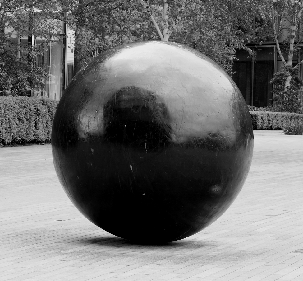
Diagonal and Rounded:
My tutor made no suggestions with these two, hence they are unaltered from the original submission. He remarked that he liked the detail of the mountain-side in "Diagonal" and the contrast in "Rounded" with the square framing.
 |
| Diagonal |
 |
| Rounded |
Rough and Smooth:
I have replaced "Rough" from my original submission with a new version (the original is blurred). "Smooth" is unaltered with my tutor commenting on the rigorous division of the steel architecture.
 |
| Rough |
 |
| Smooth |
Straight and Curved:
I have retained these two from the original submission without any corrections. My tutor commented on good composition and good sense of movement in both.
 |
| Straight |
 |
| Curved |
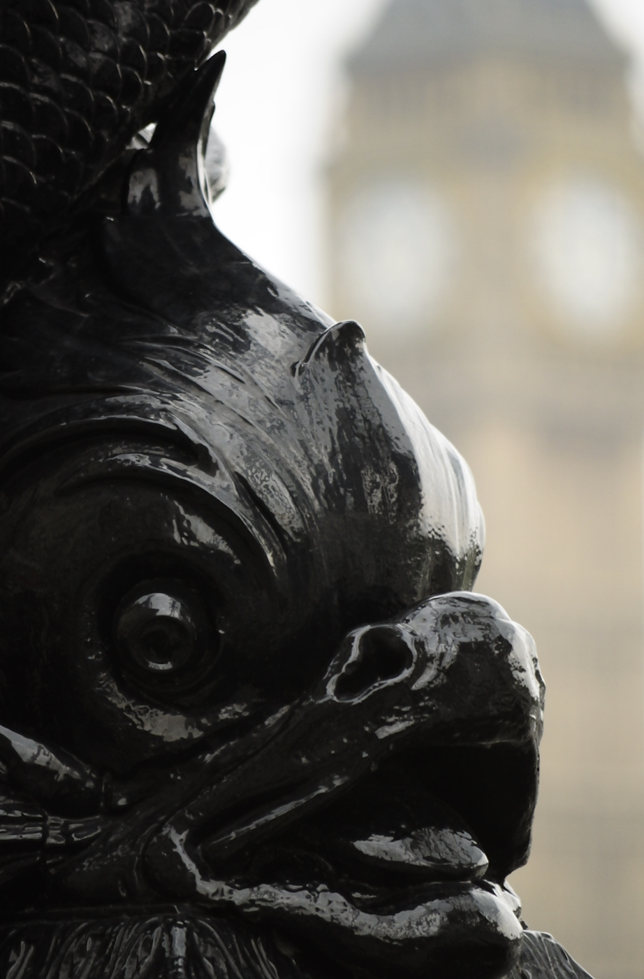
Black and White:
My tutor commented that I had cropped too much out of the rest of the fish in "Black", which made the picture look indecisive. As that framed in the shooting, I have substituted this one, which shows more of the fish and also an out of focus Big Ben in the background to add some contrast.
 |
| Black |
For "white", my tutor commented that the shot was underexposed with the shadow too dark; I have corrected the exposure in the RAW file and reposted.
 |
| White |
Light and Heavy:
These two replace "Many and Few" from my original submission, neither of which really worked very well. These two were removed in the original edit, however, my tutor pointed out that the parachutist was one of my best shots.
 |
| Light |
 |
| Heavy |
High and Low:
I have chosen to replace Pointed and Blunt myself. My tutor didn't say much about these two, but looking back I don't like them and know I could have done better.
 |
| High |
 |
| Low |
Diagonal and Rounded in one picture:
I have chosen to replace my contrast in a single shot picture from the original submission; my tutor commented that it hadn't really worked well as you couldn't see what the image was. I also wasn't very keen on the puppets image that he suggested I used, so I reshot. I think this contrast works much better.

No comments:
Post a Comment